NASA has released a new video visualizing CO2 movement in the atmosphere. The video shows CO2 emissions from major U.S. cities. Atmospheric currents create swirling eddies of the greenhouse gas.
This visualization provides unprecedented detail of CO2 patterns. Did you know? CO2 levels in the atmosphere have increased by 50% since the industrial revolution.
GEOS Model: Supercomputers Simulate Earth’s Atmospheric Dynamics
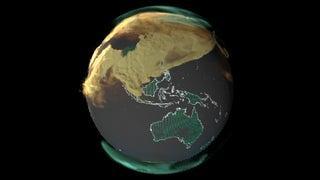
NASA uses the Goddard Earth Observing System (GEOS) model for this visualization. GEOS combines satellite data with ground observations.
Supercomputers process this data to simulate atmospheric conditions. The model provides a comprehensive view of global CO2 distribution.
Satellite Technology: Eyes in the Sky Track CO2
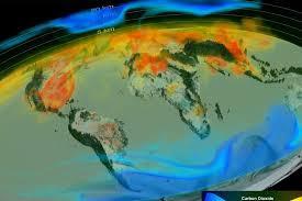
The visualization relies on data from multiple satellites. Terra satellite’s MODIS and Suomi-NPP satellite’s VIIRS provide crucial information. These instruments continuously monitor Earth’s atmosphere.
Satellite technology has revolutionized our understanding of climate change. But what unexpected patterns did these satellites reveal about CO2 distribution?
Urban Hotspots: Cities as Major CO2 Emitters
The video highlights major cities as significant CO2 sources. Urban areas produce dense plumes of the greenhouse gas. These emissions interact with weather systems in complex ways.
Understanding urban CO2 patterns is crucial for climate mitigation strategies. Cities account for about 70% of global CO2 emissions.
Atmospheric Currents: Nature’s CO2 Dispersal Mechanism

Atmospheric currents play a key role in CO2 distribution. They create swirling eddies that disperse the gas. These currents can transport CO2 over long distances.
The video reveals the dynamic nature of atmospheric CO2 movement. Did you know? The Gulf Stream, a major atmospheric current, moves at speeds up to 5.6 mph.
Daily CO2 Cycles: The Pulsing Rhythm of Emissions
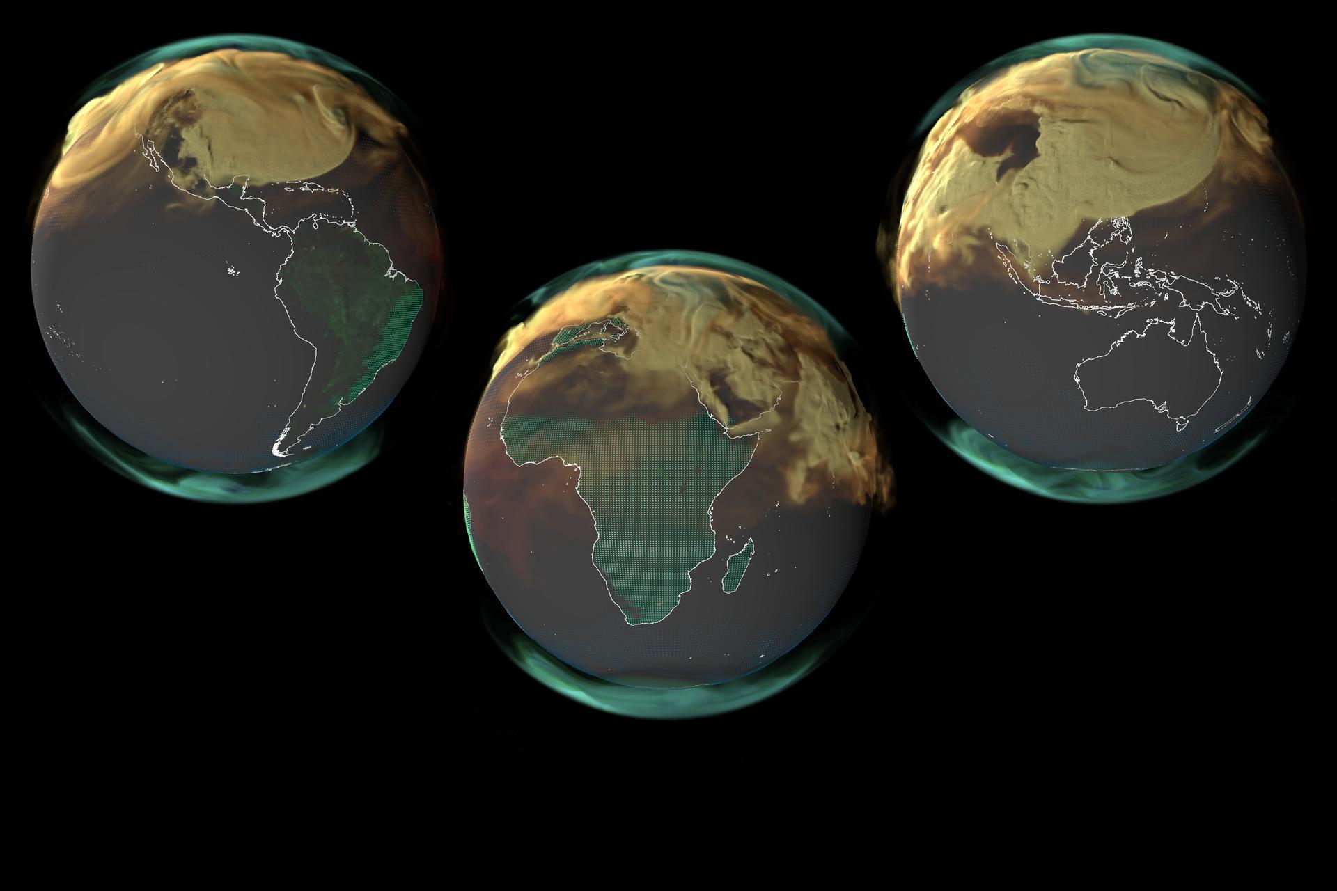
The visualization shows a pulsing pattern in CO2 emissions. This rhythm reflects daily cycles of human activity and nature. Nighttime sees a reduction in CO2 emissions from fires.
Plant photosynthesis during daylight also influences these patterns. How might these daily cycles impact our strategies for reducing CO2 emissions?
Forests: Nature’s CO2 Sinks in Action
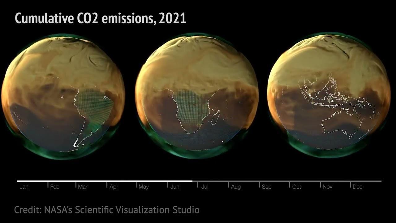
Forested areas display prominent CO2 pulsing in the video. Trees absorb CO2 during photosynthesis in daylight hours. At night, this process stops, altering local CO2 concentrations.
Forests play a crucial role in regulating atmospheric CO2 levels. Forests absorb about 2.6 billion tons of CO2 annually.
Unprecedented Detail: Plumes and Weather Interactions Revealed
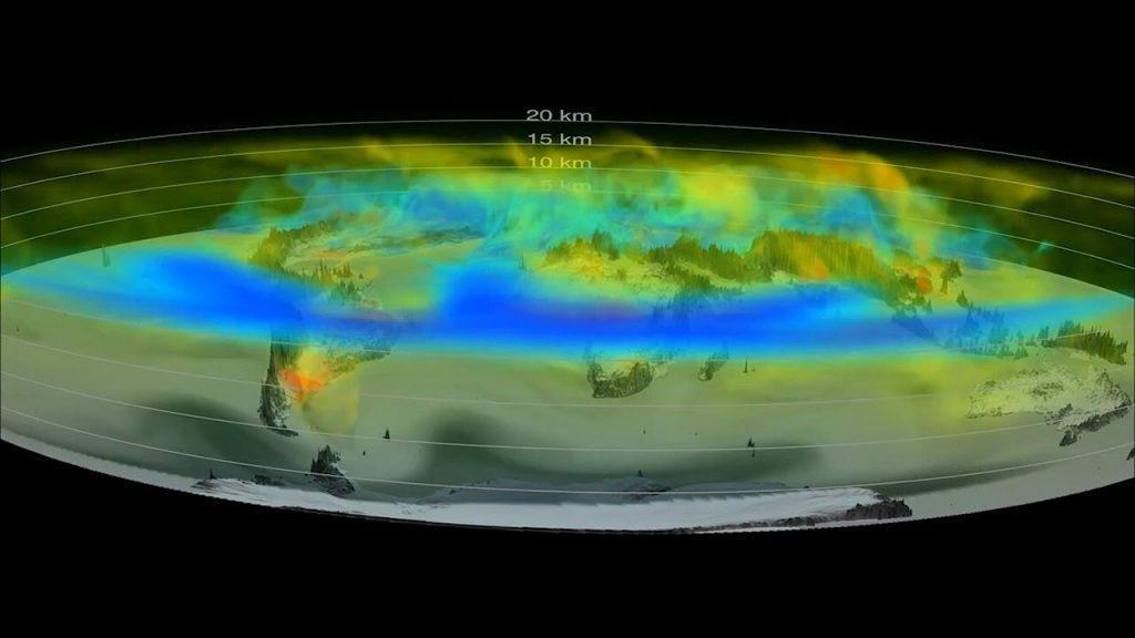
The high-resolution simulation shows persistent CO2 plumes. These plumes interact with weather systems in complex ways. Scientists were surprised by the level of detail revealed.
This new insight could improve climate models and predictions. What other atmospheric phenomena might this detailed modeling uncover?
Global CO2 Distribution: Not as Uneven as It Seems
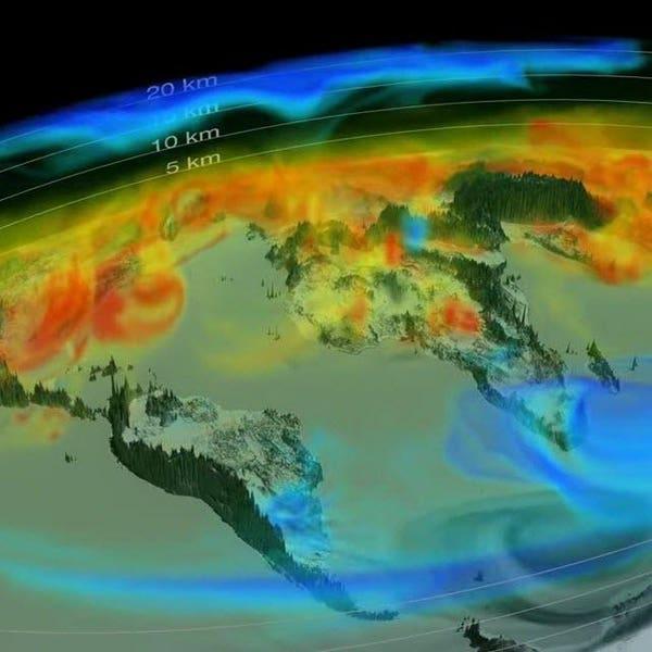
The video might suggest CO2 is absent in some areas. However, CO2 is present everywhere in the atmosphere. The visualization highlights areas of higher concentration.
This approach helps identify major emission sources and patterns. The global average atmospheric CO2 concentration surpassed 400 ppm in 2016.
Visualization Challenges: Balancing Accuracy and Impact
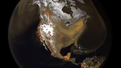
NASA faced challenges in visualizing CO2 distribution accurately. They needed to show both dense and sparse regions effectively. The team balanced scientific accuracy with visual impact.
This approach helps communicate complex data to a broader audience. How might future visualizations further enhance our understanding of climate change?

